Descriptive Statistics
"True" Mean and Confidence Interval. Probably the most often used descriptive statistic is the mean. The mean is a particularly informative measure of the "central tendency" of the variable if it is reported along with its confidence intervals. As mentioned earlier, usually we are interested in statistics (such as the mean) from our sample only to the extent to which they can infer information about the population. The confidence intervals for the mean give us a range of values around the mean where we expect the "true" (population) mean is located (with a given level of certainty, see also Elementary Concepts ). For example, if the mean in your sample is 23, and the lower and upper limits of the p =.05 confidence interval are 19 and 27 respectively, then you can conclude that there is a 95% probability that the population mean is greater than 19 and lower than 27. If you set the p -level to a smaller value, then the interval would become wider thereby increasing the "certainty" of the estimate, and vice versa; as we all know from the weather forecast, the more "vague" the prediction (i.e., wider the confidence interval), the more likely it will materialize. Note that the width of the confidence interval depends on the sample size and on the variation of data values. The larger the sample size, the more reliable its mean. The larger the variation, the less reliable the mean (see also Elementary Concepts ). The calculation of confidence intervals is based on the assumption that the variable is normally distributed in the population. The estimate may not be valid if this assumption is not met, unless the sample size is large, say n =100 or more.
Shape of the Distribution, Normality. An important aspect of the "description" of a variable is the shape of its distribution, which tells you the frequency of values from different ranges of the variable. Typically, a researcher is interested in how well the distribution can be approximated by the normal distribution (see the animation below for an example of this distribution) (see also Elementary Concepts ). Simple descriptive statistics can provide some information relevant to this issue. For example, if the skewness (which measures the deviation of the distribution from symmetry) is clearly different from 0, then that distribution is asymmetrical , while normal distributions are perfectly symmetrical . If the kurtosis (which measures "peakedness" of the distribution) is clearly different from 0, then the distribution is either flatter or more peaked than normal; the kurtosis of the normal distribution is 0.
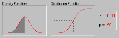
More precise information can be obtained by performing one of the tests of normality to determine the probability that the sample came from a normally distributed population of observations (e.g., the so-called Kolmogorov-Smirnov test, or the Shapiro-Wilks' W test. However, none of these tests can entirely substitute for a visual examination of the data using a histogram (i.e., a graph that shows the frequency distribution of a variable).
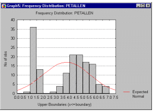
The graph allows you to evaluate the normality of the empirical distribution because it also shows the normal curve superimposed over the histogram . It also allows you to examine various aspects of the distribution qualitatively . For example, the distribution could be bimodal (have 2 peaks). This might suggest that the sample is not homogeneous but possibly its elements came from two different populations, each more or less normally distributed. In such cases, in order to understand the nature of the variable in question, you should look for a way to quantitatively identify the two sub-samples.
Correlations
Purpose (What is Correlation?) Correlation is a measure of the relation between two or more variables. The measurement scales used should be at least interval scales , but other correlation coefficients are available to handle other types of data. Correlation coefficients can range from -1.00 to +1.00. The value of -1.00 represents a perfect negative correlation while a value of +1.00 represents a perfect positive correlation . A value of 0.00 represents a lack of correlation.
The most widely-used type of correlation coefficient is Pearson r , also called linear or product- moment correlation.
Simple Linear Correlation (Pearson r). Pearson correlation (hereafter called correlation ), assumes that the two variables are measured on at least interval scales (see Elementary Concepts ), and it determines the extent to which values of the two variables are "proportional" to each other. The value of correlation (i.e., correlation coefficient) does not depend on the specific measurement units used; for example, the correlation between height and weight will be identical regardless of whether inches and pounds , or centimeters and kilograms are used as measurement units. Proportional means linearly related ; that is, the correlation is high if it can be "summarized" by a straight line (sloped upwards or downwards).
This line is called the regression line or least squares line , because it is determined such that the sum of the squared distances of all the data points from the line is the lowest possible. Note that the concept of squared distances will have important functional consequences on how the value of the correlation coefficient reacts to various specific arrangements of data (as we will later see).
How to Interpret the Values of Correlations. As mentioned before, the correlation coefficient (r) represents the linear relationship between two variables. If the correlation coefficient is squared, then the resulting value (r 2 , the coefficient of determination ) will represent the proportion of common variation in the two variables (i.e., the "strength" or "magnitude" of the relationship). In order to evaluate the correlation between variables, it is important to know this "magnitude" or "strength" as well as the significance of the correlation.
Significance of Correlations. The significance level calculated for each correlation is a primary source of information about the reliability of the correlation. As explained before (see Elementary Concepts ), the significance of a correlation coefficient of a particular magnitude will change depending on the size of the sample from which it was computed. The test of significance is based on the assumption that the distribution of the residual values (i.e., the deviations from the regression line) for the dependent variable y follows the normal distribution, and that the variability of the residual values is the same for all values of the independent variable x . However, Monte Carlo studies suggest that meeting those assumptions closely is not absolutely crucial if your sample size is not very small and when the departure from normality is not very large. It is impossible to formulate precise recommendations based on those Monte- Carlo results, but many researchers follow a rule of thumb that if your sample size is 50 or more then serious biases are unlikely, and if your sample size is over 100 then you should not be concerned at all with the normality assumptions. There are, however, much more common and serious threats to the validity of information that a correlation coefficient can provide; they are briefly discussed in the following paragraphs.
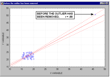
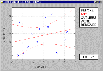
Outliers. Outliers are atypical (by definition), infrequent observations. Because of the way in which the regression line is determined (especially the fact that it is based on minimizing not the sum of simple distances but the sum of squares of distances of data points from the line), outliers have a profound influence on the slope of the regression line and consequently on the value of the correlation coefficient. A single outlier is capable of considerably changing the slope of the regression line and, consequently, the value of the correlation, as demonstrated in the following example. Note, that as shown on that illustration, just one outlier can be entirely responsible for a high value of the correlation that otherwise (without the outlier) would be close to zero. Needless to say, one should never base important conclusions on the value of the correlation coefficient alone (i.e., examining the respective scatterplot is always recommended).
Note that if the sample size is relatively small, then including or excluding specific data points that are not as clearly "outliers" as the one shown in the previous example may have a profound influence on the regression line (and the correlation coefficient). This is illustrated in the following example where we call the points being excluded "outliers;" one may argue, however, that they are not outliers but rather extreme values.
Typically, we believe that outliers represent a random error that we would like to be able to control. Unfortunately, there is no widely accepted method to remove outliers automatically (however, see the next paragraph), thus what we are left with is to identify any outliers by examining a scatterplot of each important correlation. Needless to say, outliers may not only artificially increase the value of a correlation coefficient, but they can also decrease the value of a "legitimate" correlation.
See also Confidence Ellipse .
Quantitative Approach to Outliers. Some researchers use quantitative methods to exclude outliers. For example, they exclude observations that are outside the range of ±2 standard deviations (or even ±1.5 sd's) around the group or design cell mean. In some areas of research, such "cleaning" of the data is absolutely necessary. For example, in cognitive psychology research on reaction times, even if almost all scores in an experiment are in the range of 300-700 milliseconds , just a few "distracted reactions" of 10-15 seconds will completely change the overall picture. Unfortunately, defining an outlier is subjective (as it should be), and the decisions concerning how to identify them must be made on an individual basis (taking into account specific experimental paradigms and/or "accepted practice" and general research experience in the respective area). It should also be noted that in some rare cases, the relative frequency of outliers across a number of groups or cells of a design can be subjected to analysis and provide interpretable results. For example, outliers could be indicative of the occurrence of a phenomenon that is qualitatively different than the typical pattern observed or expected in the sample, thus the relative frequency of outliers could provide evidence of a relative frequency of departure from the process or phenomenon that is typical for the majority of cases in a group. See also Confidence Ellipse .
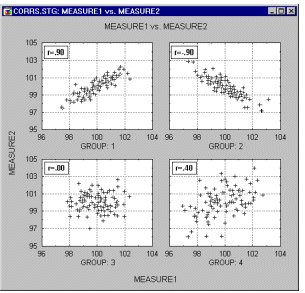
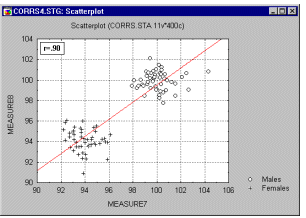
Correlations in Non-homogeneous Groups. A lack of homogeneity in the sample from which a correlation was calculated can be another factor that biases the value of the correlation. Imagine a case where a correlation coefficient is calculated from data points which came from two different experimental groups but this fact is ignored when the correlation is calculated. Let us assume that the experimental manipulation in one of the groups increased the values of both correlated variables and thus the data from each group form a distinctive "cloud" in the scatterplot (as shown in the graph below).
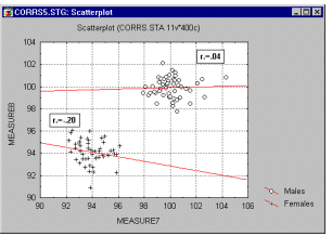
In such cases, a high correlation may result that is entirely due to the arrangement of the two groups, but which does not represent the "true" relation between the two variables, which may practically be equal to 0 (as could be seen if we looked at each group separately, see the following graph).
If you suspect the influence of such a phenomenon on your correlations and know how to identify such "subsets" of data, try to run the correlations separately in each subset of observations. If you do not know how to identify the hypothetical subsets, try to examine the data with some exploratory multivariate techniques (e.g., Cluster Analysis ).
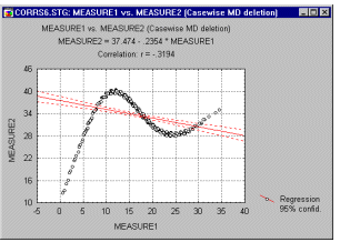
Nonlinear Relations between Variables. Another potential source of problems with the linear ( Pearson r ) correlation is the shape of the relation. As mentioned before, Pearson r measures a relation between two variables only to the extent to which it is linear; deviations from linearity will increase the total sum of squared distances from the regression line even if they represent a "true" and very close relationship between two variables. The possibility of such non-linear relationships is another reason why examining scatterplots is a necessary step in evaluating every correlation. For example, the following graph demonstrates an extremely strong correlation between the two variables which is not well described by the linear function.
Measuring Nonlinear Relations. What do you do if a correlation is strong but clearly nonlinear (as concluded from examining scatterplots)? Unfortunately, there is no simple answer to this question, because there is no easy-to-use equivalent of Pearson r that is capable of handling nonlinear relations. If the curve is monotonous (continuously decreasing or increasing) you could try to transform one or both of the variables to remove the curvilinearity and then recalculate the correlation. For example, a typical transformation used in such cases is the logarithmic function which will "squeeze" together the values at one end of the range. Another option available if the relation is monotonous is to try a nonparametric correlation (e.g., Spearman R , see Nonparametrics and Distribution Fitting ) which is sensitive only to the ordinal arrangement of values, thus, by definition, it ignores monotonous curvilinearity. However, nonparametric correlations are generally less sensitive and sometimes this method will not produce any gains. Unfortunately, the two most precise methods are not easy to use and require a good deal of "experimentation" with the data. Therefore you could:
- Try to identify the specific function that best describes the curve. After a function has been found, you can test its "goodness-of-fit" to your data.
- Alternatively, you could experiment with dividing one of the variables into a number of segments (e.g., 4 or 5) of an equal width, treat this new variable as a grouping variable and run an analysis of variance on the data.
Exploratory Examination of Correlation Matrices. A common first step of many data analyses that involve more than a very few variables is to run a correlation matrix of all variables and then examine it for expected (and unexpected) significant relations. When this is done, you need to be aware of the general nature of statistical significance (see Elementary Concepts ); specifically, if you run many tests (in this case, many correlations), then significant results will be found "surprisingly often" due to pure chance. For example, by definition, a coefficient significant at the .05 level will occur by chance once in every 20 coefficients. There is no "automatic" way to weed out the "true" correlations. Thus, you should treat all results that were not predicted or planned with particular caution and look for their consistency with other results; ultimately, though, the most conclusive (although costly) control for such a randomness factor is to replicate the study. This issue is general and it pertains to all analyses that involve "multiple comparisons and statistical significance." This problem is also briefly discussed in the context of post-hoc comparisons of means and the Breakdowns option.
Casewise vs. Pairwise Deletion of Missing Data. The default way of deleting missing data while calculating a correlation matrix is to exclude all cases that have missing data in at least one of the selected variables; that is, by casewise deletion of missing data. Only this way will you get a "true" correlation matrix, where all correlations are obtained from the same set of observations. However, if missing data are randomly distributed across cases, you could easily end up with no "valid" cases in the data set, because each of them will have at least one missing data in some variable. The most common solution used in such instances is to use so-called pairwise deletion of missing data in correlation matrices, where a correlation between each pair of variables is calculated from all cases that have valid data on those two variables. In many instances there is nothing wrong with that method, especially when the total percentage of missing data is low, say 10%, and they are relatively randomly distributed between cases and variables. However, it may sometimes lead to serious problems.
For example, a systematic bias may result from a "hidden" systematic distribution of missing data, causing different correlation coefficients in the same correlation matrix to be based on different subsets of subjects. In addition to the possibly biased conclusions that you could derive from such "pairwise calculated" correlation matrices, real problems may occur when you subject such matrices to another analysis (e.g., multiple regression , factor analysis , or cluster analysis ) that expects a "true correlation matrix," with a certain level of consistency and "transitivity" between different coefficients. Thus, if you are using the pairwise method of deleting the missing data, be sure to examine the distribution of missing data across the cells of the matrix for possible systematic "patterns."
How to Identify Biases Caused by the Bias due to Pairwise Deletion of Missing Data. If the pairwise deletion of missing data does not introduce any systematic bias to the correlation matrix, then all those pairwise descriptive statistics for one variable should be very similar. However, if they differ, then there are good reasons to suspect a bias. For example, if the mean (or standard deviation) of the values of variable A that were taken into account in calculating its correlation with variable B is much lower than the mean (or standard deviation) of those values of variable A that were used in calculating its correlation with variable C, then we would have good reason to suspect that those two correlations (A-B and A-C) are based on different subsets of data, and thus, that there is a bias in the correlation matrix caused by a non-random distribution of missing data.
Pairwise Deletion of Missing Data vs. Mean Substitution. Another common method to avoid loosing data due to casewise deletion is the so-called mean substitution of missing data (replacing all missing data in a variable by the mean of that variable). Mean substitution offers some advantages and some disadvantages as compared to pairwise deletion. Its main advantage is that it produces "internally consistent" sets of results ("true" correlation matrices). The main disadvantages are:
- Mean substitution artificially decreases the variation of scores, and this decrease in individual variables is proportional to the number of missing data (i.e., the more missing data, the more "perfectly average scores" will be artificially added to the data set).
- Because it substitutes missing data with artificially created "average" data points, mean substitution may considerably change the values of correlations.
Spurious Correlations. Although you cannot prove causal relations based on correlation coefficients (see Elementary Concepts ), you can still identify so-called spurious correlations; that is, correlations that are due mostly to the influences of "other" variables. For example, there is a correlation between the total amount of losses in a fire and the number of firemen that were putting out the fire; however, what this correlation does not indicate is that if you call fewer firemen then you would lower the losses. There is a third variable (the initial size of the fire) that influences both the amount of losses and the number of firemen. If you "control" for this variable (e.g., consider only fires of a fixed size), then the correlation will either disappear or perhaps even change its sign. The main problem with spurious correlations is that we typically do not know what the "hidden" agent is. However, in cases when we know where to look, we can use partial correlations that control for ( partial out ) the influence of specified variables.
Are correlation coefficients "additive?" No, they are not. For example, an average of correlation coefficients in a number of samples does not represent an "average correlation" in all those samples. Because the value of the correlation coefficient is not a linear function of the magnitude of the relation between the variables, correlation coefficients cannot simply be averaged. In cases when you need to average correlations, they first have to be converted into additive measures. For example, before averaging, you can square them to obtain coefficients of determination which are additive (as explained before in this section), or convert them into so-called Fisher z values, which are also additive.
How to Determine Whether Two Correlation Coefficients are Significant. A test is available that will evaluate the significance of differences between two correlation coefficients in two samples. The outcome of this test depends not only on the size of the raw difference between the two coefficients but also on the size of the samples and on the size of the coefficients themselves. Consistent with the previously discussed principle, the larger the sample size, the smaller the effect that can be proven significant in that sample. In general, due to the fact that the reliability of the correlation coefficient increases with its absolute value, relatively small differences between large correlation coefficients can be significant. For example, a difference of .10 between two correlations may not be significant if the two coefficients are .15 and .25, although in the same sample, the same difference of .10 can be highly significant if the two coefficients are .80 and .90.
t-test for independent samples
Purpose, Assumptions. The t -test is the most commonly used method to evaluate the differences in means between two groups. For example, the t -test can be used to test for a difference in test scores between a group of patients who were given a drug and a control group who received a placebo. Theoretically, the t-test can be used even if the sample sizes are very small (e.g., as small as 10; some researchers claim that even smaller n 's are possible), as long as the variables are normally distributed within each group and the variation of scores in the two groups is not reliably different (see also Elementary Concepts ). As mentioned before, the normality assumption can be evaluated by looking at the distribution of the data (via histograms ) or by performing a normality test. The equality of variances assumption can be verified with the F test, or you can use the more robust Levene's test . If these conditions are not met, then you can evaluate the differences in means between two groups using one of the nonparametric alternatives to the t - test (see Nonparametrics and Distribution Fitting ).
The p -level reported with a t -test represents the probability of error involved in accepting our research hypothesis about the existence of a difference. Technically speaking, this is the probability of error associated with rejecting the hypothesis of no difference between the two categories of observations (corresponding to the groups) in the population when, in fact, the hypothesis is true. Some researchers suggest that if the difference is in the predicted direction, you can consider only one half (one "tail") of the probability distribution and thus divide the standard p -level reported with a t -test (a "two-tailed" probability) by two. Others, however, suggest that you should always report the standard, two-tailed t-test probability.
See also, Student's t Distribution .
Arrangement of Data. In order to perform the t -test for independent samples, one independent ( grouping ) variable (e.g., Gender: male/female ) and at least one dependent variable (e.g., a test score) are required. The means of the dependent variable will be compared between selected groups based on the specified values (e.g., male and female ) of the independent variable. The following data set can be analyzed with a t -test comparing the average WCC score in males and females .
GENDER WCC case 1
case 2
case 3
case 4
case 5
mean WCC in males = 110
mean WCC in females = 103
|
male
male
male
female
female |
111
110
109
102
104 |
|
t-test graphs. In the t -test analysis, comparisons of means and measures of variation in the two groups can be visualized in box and whisker plots (for an example, see the graph below).
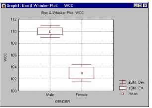
These graphs help you to quickly evaluate and "intuitively visualize" the strength of the relation between the grouping and the dependent variable.
More Complex Group Comparisons. It often happens in research practice that you need to compare more than two groups (e.g., drug 1 , drug 2 , and placebo ), or compare groups created by more than one independent variable while controlling for the separate influence of each of them (e.g., Gender , type of Drug , and size of Dose ). In these cases, you need to analyze the data using Analysis of Variance , which can be considered to be a generalization of the t -test. In fact, for two group comparisons, ANOVA will give results identical to a t -test ( t**2 [df] = F[1,df] ). However, when the design is more complex, ANOVA offers numerous advantages that t -tests cannot provide (even if you run a series of t - tests comparing various cells of the design).
t-test for dependent samples
Within-group Variation. As explained in Elementary Concepts , the size of a relation between two variables, such as the one measured by a difference in means between two groups, depends to a large extent on the differentiation of values within the group. Depending on how differentiated the values are in each group, a given "raw difference" in group means will indicate either a stronger or weaker relationship between the independent ( grouping ) and dependent variable. For example, if the mean WCC (White Cell Count) was 102 in males and 104 in females, then this difference of "only" 2 points would be extremely important if all values for males fell within a range of 101 to 103, and all scores for females fell within a range of 103 to 105; for example, we would be able to predict WCC pretty well based on gender. However, if the same difference of 2 was obtained from very differentiated scores (e.g., if their range was 0-200), then we would consider the difference entirely negligible. That is to say, reduction of the within-group variation increases the sensitivity of our test.
Purpose. The t -test for dependent samples helps us to take advantage of one specific type of design in which an important source of within-group variation (or so-called, error ) can be easily identified and excluded from the analysis. Specifically, if two groups of observations (that are to be compared) are based on the same sample of subjects who were tested twice (e.g., before and after a treatment), then a considerable part of the within-group variation in both groups of scores can be attributed to the initial individual differences between subjects. Note that, in a sense, this fact is not much different than in cases when the two groups are entirely independent (see t -test for independent samples ), where individual differences also contribute to the error variance ; but in the case of independent samples, we cannot do anything about it because we cannot identify (or "subtract") the variation due to individual differences in subjects. However, if the same sample was tested twice, then we can easily identify (or "subtract") this variation. Specifically, instead of treating each group separately, and analyzing raw scores, we can look only at the differences between the two measures (e.g., "pre-test" and "post test") in each subject. By subtracting the first score from the second for each subject and then analyzing only those "pure (paired) differences," we will exclude the entire part of the variation in our data set that results from unequal base levels of individual subjects. This is precisely what is being done in the t -test for dependent samples, and, as compared to the t -test for independent samples, it always produces "better" results (i.e., it is always more sensitive).
Assumptions. The theoretical assumptions of the t -test for independent samples also apply to the dependent samples test; that is, the paired differences should be normally distributed. If these assumptions are clearly not met, then one of the nonparametric alternative tests should be used.
See also, Student's t Distribution .
Arrangement of Data. Technically, we can apply the t -test for dependent samples to any two variables in our data set. However, applying this test will make very little sense if the values of the two variables in the data set are not logically and methodologically comparable. For example, if you compare the average WCC in a sample of patients before and after a treatment, but using a different counting method or different units in the second measurement, then a highly significant t -test value could be obtained due to an artifact; that is, to the change of units of measurement. Following, is an example of a data set that can be analyzed using the t -test for dependent samples.
WCC
before WCC
after case 1
case 2
case 3
case 4
case 5
...
average change between WCC
"before" and "after" = 1
|
111.9
109
143
101
80
... |
113
110
144
102
80.9
... |
|
The average difference between the two conditions is relatively small ( d=1 ) as compared to the differentiation (range) of the raw scores (from 80 to 143, in the first sample). However, the t -test for dependent samples analysis is performed only on the paired differences , "ignoring" the raw scores and their potential differentiation. Thus, the size of this particular difference of 1 will be compared not to the differentiation of raw scores but to the differentiation of the individual difference scores , which is relatively small: 0.2 (from 0.9 to 1.1 ). Compared to that variability, the difference of 1 is extremely large and can yield a highly significant t value.
Matrices of t-tests. t -tests for dependent samples can be calculated for long lists of variables, and reviewed in the form of matrices produced with casewise or pairwise deletion of missing data, much like the correlation matrices . Thus, the precautions discussed in the context of correlations also apply to t -test matrices; see:
- the issue of artifacts caused by the pairwise deletion of missing data in t -tests and
- the issue of "randomly" significant test values.
More Complex Group Comparisons. If there are more than two "correlated samples" (e.g., before treatment , after treatment 1 , and after treatment 2 ), then analysis of variance with repeated measures should be used. The repeated measures ANOVA can be considered a generalization of the t-test for dependent samples and it offers various features that increase the overall sensitivity of the analysis. For example, it can simultaneously control not only for the base level of the dependent variable, but it can control for other factors and/or include in the design more than one interrelated dependent variable (MANOVA; for additional details refer to ANOVA/MANOVA ).
Breakdown: Descriptive Statistics by Groups
Purpose. The breakdowns analysis calculates descriptive statistics and correlations for dependent variables in each of a number of groups defined by one or more grouping ( independent ) variables.
Arrangement of Data. In the following example data set (spreadsheet), the dependent variable WCC (White Cell Count) can be broken down by 2 independent variables: Gender (values: males and females ), and Height (values: tall and short ).
GENDER HEIGHT WCC case 1
case 2
case 3
case 4
case 5
...
|
male
male
male
female
female
... |
short
tall
tall
tall
short
... |
101
110
92
112
95
... |
The resulting breakdowns might look as follows (we are assuming that Gender was specified as the first independent variable, and Height as the second).
Entire sample
Mean=100
SD=13
N=120 |
Males
Mean=99
SD=13
N=60 |
Females
Mean=101
SD=13
N=60 |
Tall/males
Mean=98
SD=13
N=30 |
Short/males
Mean=100
SD=13
N=30 |
Tall/females
Mean=101
SD=13
N=30 |
Short/females
Mean=101
SD=13
N=30 |
The composition of the "intermediate" level cells of the "breakdown tree" depends on the order in which independent variables are arranged. For example, in the above example, you see the means for "all males" and "all females" but you do not see the means for "all tall subjects" and "all short subjects" which would have been produced had you specified independent variable Height as the first grouping variable rather than the second.
Statistical Tests in Breakdowns. Breakdowns are typically used as an exploratory data analysis technique; the typical question that this technique can help answer is very simple: Are the groups created by the independent variables different regarding the dependent variable? If you are interested in differences concerning the means, then the appropriate test is the breakdowns one-way ANOVA ( F test). If you are interested in variation differences, then you should test for homogeneity of variances.
Other Related Data Analysis Techniques. Although for exploratory data analysis, breakdowns can use more than one independent variable, the statistical procedures in breakdowns assume the existence of a single grouping factor (even if, in fact, the breakdown results from a combination of a number of grouping variables ). Thus, those statistics do not reveal or even take into account any possible interactions between grouping variables in the design. For example, there could be differences between the influence of one independent variable on the dependent variable at different levels of another independent variable (e.g., tall people could have lower WCC than short ones, but only if they are males; see the "tree" data above). You can explore such effects by examining breakdowns "visually," using different orders of independent variables, but the magnitude or significance of such effects cannot be estimated by the breakdown statistics.
Post-Hoc Comparisons of Means. Usually, after obtaining a statistically significant F test from the ANOVA, one wants to know which of the means contributed to the effect (i.e., which groups are particularly different from each other). One could of course perform a series of simple t -tests to compare all possible pairs of means. However, such a procedure would capitalize on chance . This means that the reported probability levels would actually overestimate the statistical significance of mean differences. Without going into too much detail, suppose you took 20 samples of 10 random numbers each, and computed 20 means. Then, take the group (sample) with the highest mean and compare it with that of the lowest mean. The t -test for independent samples will test whether or not those two means are significantly different from each other, provided they were the only two samples taken. Post-hoc comparison techniques on the other hand specifically take into account the fact that more than two samples were taken.
Breakdowns vs. Discriminant Function Analysis. Breakdowns can be considered as a first step toward another type of analysis that explores differences between groups: Discriminant function analysis . Similar to breakdowns, discriminant function analysis explores the differences between groups created by values (group codes ) of an independent ( grouping ) variable. However, unlike breakdowns, discriminant function analysis simultaneously analyzes more than one dependent variable and it identifies "patterns" of values of those dependent variables. Technically, it determines a linear combination of the dependent variables that best predicts the group membership. For example, discriminant function analysis can be used to analyze differences between three groups of persons who have chosen different professions (e.g., lawyers, physicians, and engineers) in terms of various aspects of their scholastic performance in high school. One could claim that such analysis could "explain" the choice of a profession in terms of specific talents shown in high school; thus discriminant function analysis can be considered to be an "exploratory extension" of simple breakdowns.
Breakdowns vs. Frequency Tables. Another related type of analysis that cannot be directly performed with breakdowns is comparisons of frequencies of cases ( n 's) between groups . Specifically, often the n 's in individual cells are not equal because the assignment of subjects to those groups typically results not from an experimenter's manipulation, but from subjects' pre-existing dispositions. If, in spite of the random selection of the entire sample, the n 's are unequal, then it may suggest that the independent variables are related. For example, crosstabulating levels of independent variables Age and Education most likely would not create groups of equal n , because education is distributed differently in different age groups. If you are interested in such comparisons, you can explore specific frequencies in the breakdowns tables, trying different orders of independent variables. However, in order to subject such differences to statistical tests, you should use crosstabulations and frequency tables, Log-Linear Analysis, or Correspondence Analysis (for more advanced analyses on multi-way frequency tables).
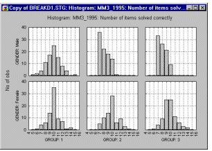
Graphical breakdowns. Graphs can often identify effects (both expected and unexpected) in the data more quickly and sometimes "better" than any other data analysis method. Categorized graphs allow you to plot the means, distributions, correlations, etc. across the groups of a given table (e.g., categorized histograms, categorized probability plots, categorized box and whisker plots). The graph below shows a categorized histogram which enables you to quickly evaluate and visualize the shape of the data for each group (group1-female, group2-female, etc.).
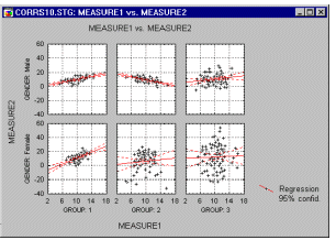
The categorized scatterplot (in the graph below) shows the differences between patterns of correlations between dependent variables across the groups.
Additionally, if the software has a brushing facility which supports animated brushing, you can select (i.e., highlight) in a matrix scatterplot all data points that belong to a certain category in order to examine how those specific observations contribute to relations between other variables in the same data set.
![[Animated Brushing]](basic_images/brushing.gif)
Frequency tables
Purpose. Frequency or one-way tables represent the simplest method for analyzing categorical ( nominal ) data (refer to Elementary Concepts ). They are often used as one of the exploratory procedures to review how different categories of values are distributed in the sample. For example, in a survey of spectator interest in different sports, we could summarize the respondents' interest in watching football in a frequency table as follows:
STATISTICA
BASIC
STATS FOOTBALL: "Watching football" Category Count Cumulatv
Count Percent Cumulatv
Percent ALWAYS : Always interested
USUALLY : Usually interested
SOMETIMS: Sometimes interested
NEVER : Never interested
Missing
|
|
39
16
26
19
0 |
39
55
81
100
100 |
39.00000
16.00000
26.00000
19.00000
0.00000 |
39.0000
55.0000
81.0000
100.0000
100.0000 |
The table above shows the number, proportion, and cumulative proportion of respondents who characterized their interest in watching football as either (1) Always interested , (2) Usually interested , (3) Sometimes interested , or (4) Never interested .
Applications. In practically every research project, a first "look" at the data usually includes frequency tables. For example, in survey research, frequency tables can show the number of males and females who participated in the survey, the number of respondents from particular ethnic and racial backgrounds, and so on. Responses on some labeled attitude measurement scales (e.g., interest in watching football) can also be nicely summarized via the frequency table. In medical research, one may tabulate the number of patients displaying specific symptoms; in industrial research one may tabulate the frequency of different causes leading to catastrophic failure of products during stress tests (e.g., which parts are actually responsible for the complete malfunction of television sets under extreme temperatures?). Customarily, if a data set includes any categorical data, then one of the first steps in the data analysis is to compute a frequency table for those categorical variables.
Crosstabulation and stub-and-banner tables
Purpose and Arrangement of Table. Crosstabulation is a combination of two (or more) frequency tables arranged such that each cell in the resulting table represents a unique combination of specific values of crosstabulated variables. Thus, crosstabulation allows us to examine frequencies of observations that belong to specific categories on more than one variable. By examining these frequencies, we can identify relations between crosstabulated variables. Only categorical ( nominal ) variables or variables with a relatively small number of different meaningful values should be crosstabulated. Note that in the cases where we do want to include a continuous variable in a crosstabulation (e.g., income), we can first recode it into a particular number of distinct ranges (e.g., low, medium, high).
2x2 Table. The simplest form of crosstabulation is the 2 by 2 table where two variables are "crossed," and each variable has only two distinct values. For example, suppose we conduct a simple study in which males and females are asked to choose one of two different brands of soda pop (brand A and brand B ); the data file can be arranged like this:
GENDER SODA case 1
case 2
case 3
case 4
case 5
...
|
MALE
FEMALE
FEMALE
FEMALE
MALE
... |
A
B
B
A
B
... |
The resulting crosstabulation could look as follows.
SODA: A SODA: B GENDER: MALE
GENDER: FEMALE
|
| 20 (40%) |
30 (60%) |
50 (50%) |
| 30 (60%) |
20 (40%) |
50 (50%) |
|
50 (50%) |
50 (50%) |
100 (100%) |
Each cell represents a unique combination of values of the two crosstabulated variables (row variable Gender and column variable Soda ), and the numbers in each cell tell us how many observations fall into each combination of values. In general, this table shows us that more females than males chose the soda pop brand A , and that more males than females chose soda B . Thus, gender and preference for a particular brand of soda may be related (later we will see how this relationship can be measured).
Marginal Frequencies. The values in the margins of the table are simply one-way (frequency) tables for all values in the table. They are important in that they help us to evaluate the arrangement of frequencies in individual columns or rows. For example, the frequencies of 40% and 60% of males and females (respectively) who chose soda A (see the first column of the above table), would not indicate any relationship between Gender and Soda if the marginal frequencies for Gender were also 40% and 60%; in that case they would simply reflect the different proportions of males and females in the study. Thus, the differences between the distributions of frequencies in individual rows (or columns) and in the respective margins informs us about the relationship between the crosstabulated variables.
Column, Row, and Total Percentages. The example in the previous paragraph demonstrates that in order to evaluate relationships between crosstabulated variables, we need to compare the proportions of marginal and individual column or row frequencies. Such comparisons are easiest to perform when the frequencies are presented as percentages.
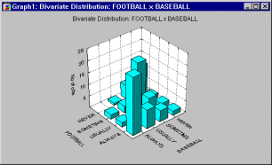
Graphical Representations of Crosstabulations. For analytic purposes, the individual rows or columns of a table can be represented as column graphs. However, often it is useful to visualize the entire table in a single graph. A two-way table can be visualized in a 3-dimensional histogram; alternatively, a categorized histogram can be produced, where one variable is represented by individual histograms which are drawn at each level (category) of the other variable in the crosstabulation. The advantage of the 3D histogram is that it produces an integrated picture of the entire table; the advantage of the categorized graph is that it allows us to precisely evaluate specific frequencies in each cell of the table.
Stub-and-Banner Tables. Stub-and-Banner tables, or Banners for short, are a way to display several two-way tables in a compressed form. This type of table is most easily explained with an example. Let us return to the survey of sports spectators example. (Note that, in order simplify matters, only the response categories Always and Usually were tabulated in the table below.)
STATISTICA
BASIC
STATS Stub-and-Banner Table:
Row Percent Factor FOOTBALL
ALWAYS FOOTBALL
USUALLY Row
Total BASEBALL: ALWAYS
BASEBALL: USUALLY
BASEBALL: Total
TENNIS: ALWAYS
TENNIS: USUALLY
TENNIS: Total
BOXING: ALWAYS
BOXING: USUALLY
BOXING : Total
|
|
92.31
61.54 |
7.69
38.46 |
66.67
33.33 |
| 82.05 |
17.95 |
100.00 |
87.50
87.50 |
12.50
12.50 |
66.67
33.33 |
| 87.50 |
12.50 |
100.00 |
77.78
100.00 |
22.22
0.00 |
52.94
47.06 |
| 88.24 |
11.76 |
100.00 |
Interpreting the Banner Table. In the table above, we see the two-way tables of expressed interest in Football by expressed interest in Baseball , Tennis , and Boxing . The table entries represent percentages of rows, so that the percentages across columns will add up to 100 percent. For example, the number in the upper left hand corner of the Scrollsheet ( 92.31 ) shows that 92.31 percent of all respondents who said they are always interested in watching football also said that they were always interested in watching baseball. Further down we can see that the percent of those always interested in watching football who were also always interested in watching tennis was 87.50 percent; for boxing this number is 77.78 percent. The percentages in the last column (Row Total) are always relative to the total number of cases.
Multi-way Tables with Control Variables. When only two variables are crosstabulated, we call the resulting table a two-way table. However, the general idea of crosstabulating values of variables can be generalized to more than just two variables. For example, to return to the "soda" example presented earlier (see above), a third variable could be added to the data set. This variable might contain information about the state in which the study was conducted (either Nebraska or New York ).
GENDER SODA STATE case 1
case 2
case 3
case 4
case 5
...
|
MALE
FEMALE
FEMALE
FEMALE
MALE
... |
A
B
B
A
B
... |
NEBRASKA
NEW YORK
NEBRASKA
NEBRASKA
NEW YORK
... |
The crosstabulation of these variables would result in a 3-way table:
STATE: NEW YORK STATE: NEBRASKA SODA: A SODA: B SODA: A SODA: B G:MALE
G:FEMALE
|
|
| 20 |
30 |
50 |
5 |
45 |
50 |
| 30 |
20 |
50 |
45 |
5 |
50 |
| 50 |
50 |
100 |
50 |
50 |
100 |
Theoretically, an unlimited number of variables can be crosstabulated in a single multi-way table. However, research practice shows that it is usually difficult to examine and "understand" tables that involve more than 4 variables. It is recommended to analyze relationships between the factors in such tables using modeling techniques such as Log-Linear Analysis or Correspondence Analysis .
Graphical Representations of Multi-way Tables. You can produce "double categorized" histograms, 3D histograms,
or line-plots that will summarize the frequencies for up to 3 factors in a single graph.
Batches (cascades) of graphs can be used to summarize higher-way tables (as shown in the graph below).
Statistics in Crosstabulation Tables
General Introduction. Crosstabulations generally allow us to identify relationships between the crosstabulated variables. The following table illustrates an example of a very strong relationship between two variables: variable Age ( Adult vs. Child ) and variable Cookie preference ( A vs. B ).
COOKIE: A COOKIE: B AGE: ADULT
AGE: CHILD
|
| 50 |
0 |
50 |
| 0 |
50 |
50 |
|
50 |
50 |
100 |
All adults chose cookie A , while all children chose cookie B . In this case there is little doubt about the reliability of the finding, because it is hardly conceivable that one would obtain such a pattern of frequencies by chance alone; that is, without the existence of a "true" difference between the cookie preferences of adults and children. However, in real-life, relations between variables are typically much weaker, and thus the question arises as to how to measure those relationships, and how to evaluate their reliability (statistical significance). The following review includes the most common measures of relationships between two categorical variables; that is, measures for two-way tables. The techniques used to analyze simultaneous relations between more than two variables in higher order crosstabulations are discussed in the context of the Log-Linear Analysis module and the Correspondence Analysis .
Pearson Chi-square. The Pearson Chi-square is the most common test for significance of the relationship between categorical variables. This measure is based on the fact that we can compute the expected frequencies in a two-way table (i.e., frequencies that we would expect if there was no relationship between the variables). For example, suppose we ask 20 males and 20 females to choose between two brands of soda pop (brands A and B ). If there is no relationship between preference and gender, then we would expect about an equal number of choices of brand A and brand B for each sex. The Chi-square test becomes increasingly significant as the numbers deviate further from this expected pattern; that is, the more this pattern of choices for males and females differs.
The value of the Chi-square and its significance level depends on the overall number of observations and the number of cells in the table. Consistent with the principles discussed in Elementary Concepts , relatively small deviations of the relative frequencies across cells from the expected pattern will prove significant if the number of observations is large.
The only assumption underlying the use of the Chi-square (other than random selection of the sample) is that the expected frequencies are not very small. The reason for this is that, actually, the Chi-square inherently tests the underlying probabilities in each cell; and when the expected cell frequencies fall, for example, below 5, those probabilities cannot be estimated with sufficient precision. For further discussion of this issue refer to Everitt (1977), Hays (1988), or Kendall and Stuart (1979).
Maximum-Likelihood Chi-square. The Maximum-Likelihood Chi-square tests the same hypothesis as the Pearson Chi- square statistic; however, its computation is based on Maximum-Likelihood theory. In practice, the M-L Chi-square is usually very close in magnitude to the Pearson Chi- square statistic. For more details about this statistic refer to Bishop, Fienberg, and Holland (1975), or Fienberg, S. E. (1977); the Log-Linear Analysis chapter of the manual also discusses this statistic in greater detail.
Yates Correction. The approximation of the Chi-square statistic in small 2 x 2 tables can be improved by reducing the absolute value of differences between expected and observed frequencies by 0.5 before squaring ( Yates' correction ). This correction, which makes the estimation more conservative, is usually applied when the table contains only small observed frequencies, so that some expected frequencies become less than 10 (for further discussion of this correction, see Conover, 1974; Everitt, 1977; Hays, 1988; Kendall & Stuart, 1979; and Mantel, 1974).
Fisher Exact Test. This test is only available for 2x2 tables; it is based on the following rationale: Given the marginal frequencies in the table, and assuming that in the population the two factors in the table are not related, how likely is it to obtain cell frequencies as uneven or worse than the ones that were observed? For small n , this probability can be computed exactly by counting all possible tables that can be constructed based on the marginal frequencies. Thus, the Fisher exact test computes the exact probability under the null hypothesis of obtaining the current distribution of frequencies across cells, or one that is more uneven.
McNemar Chi-square. This test is applicable in situations where the frequencies in the 2 x 2 table represent dependent samples. For example, in a before-after design study, we may count the number of students who fail a test of minimal math skills at the beginning of the semester and at the end of the semester. Two Chi-square values are reported: A/D and B/C . The Chi-square A/D tests the hypothesis that the frequencies in cells A and D (upper left, lower right) are identical. The Chi-square B/C tests the hypothesis that the frequencies in cells B and C (upper right, lower left) are identical.
Coefficient Phi. The Phi-square is a measure of correlation between two categorical variables in a 2 x 2 table. Its value can range from 0 (no relation between factors; Chi-square =0.0) to 1 (perfect relation between the two factors in the table). For more details concerning this statistic see Castellan and Siegel (1988, p. 232).
Tetrachoric Correlation. This statistic is also only computed for (applicable to) 2 x 2 tables. If the 2 x 2 table can be thought of as the result of two continuous variables that were (artificially) forced into two categories each, then the tetrachoric correlation coefficient will estimate the correlation between the two.
Coefficient of Contingency. The coefficient of contingency is a Chi-square based measure of the relation between two categorical variables (proposed by Pearson, the originator of the Chi-square test). Its advantage over the ordinary Chi-square is that it is more easily interpreted, since its range is always limited to 0 through 1 (where 0 means complete independence). The disadvantage of this statistic is that its specific upper limit is "limited" by the size of the table; C can reach the limit of 1 only if the number of categories is unlimited (see Siegel, 1956, p. 201).
Interpretation of Contingency Measures. An important disadvantage of measures of contingency (reviewed above) is that they do not lend themselves to clear interpretations in terms of probability or "proportion of variance," as is the case, for example, of the Pearson r (see Correlations ). There is no commonly accepted measure of relation between categories that has such a clear interpretation.
Statistics Based on Ranks. In many cases the categories used in the crosstabulation contain meaningful rank-ordering information; that is, they measure some characteristic on an <> ordinal scale (see Elementary Concepts ). Suppose we asked a sample of respondents to indicate their interest in watching different sports on a 4-point scale with the explicit labels (1) always , (2) usually , (3) sometimes , and (4) never interested . Obviously, we can assume that the response sometimes interested is indicative of less interest than always interested , and so on. Thus, we could rank the respondents with regard to their expressed interest in, for example, watching football. When categorical variables can be interpreted in this manner, there are several additional indices that can be computed to express the relationship between variables.
Spearman R. Spearman R can be thought of as the regular Pearson product-moment correlation coefficient (Pearson r ); that is, in terms of the proportion of variability accounted for, except that Spearman R is computed from ranks. As mentioned above, Spearman R assumes that the variables under consideration were measured on at least an ordinal (rank order) scale; that is, the individual observations (cases) can be ranked into two ordered series. Detailed discussions of the Spearman R statistic, its power and efficiency can be found in Gibbons (1985), Hays (1981), McNemar (1969), Siegel (1956), Siegel and Castellan (1988), Kendall (1948), Olds (1949), or Hotelling and Pabst (1936).
Kendall tau. Kendall tau is equivalent to the Spearman R statistic with regard to the underlying assumptions. It is also comparable in terms of its statistical power. However, Spearman R and Kendall tau are usually not identical in magnitude because their underlying logic, as well as their computational formulas are very different. Siegel and Castellan (1988) express the relationship of the two measures in terms of the inequality:
-1 < = 3 * Kendall tau - 2 * Spearman R < = 1
More importantly, Kendall tau and Spearman R imply different interpretations: While Spearman R can be thought of as the regular Pearson product-moment correlation coefficient as computed from ranks, Kendall tau rather represents a probability . Specifically, it is the difference between the probability that the observed data are in the same order for the two variables versus the probability that the observed data are in different orders for the two variables. Kendall (1948, 1975), Everitt (1977), and Siegel and Castellan (1988) discuss Kendall tau in greater detail. Two different variants of tau are computed, usually called tau b and tau c . These measures differ only with regard as to how tied ranks are handled. In most cases these values will be fairly similar, and when discrepancies occur, it is probably always safest to interpret the lowest value.
Sommer's d: d(X|Y), d(Y|X). Sommer's d is an asymmetric measure of association related to t b (see Siegel & Castellan, 1988, p. 303-310).
Gamma. The Gamma statistic is preferable to Spearman R or Kendall tau when the data contain many tied observations. In terms of the underlying assumptions, Gamma is equivalent to Spearman R or Kendall tau ; in terms of its interpretation and computation, it is more similar to Kendall tau than Spearman R . In short, Gamma is also a probability ; specifically, it is computed as the difference between the probability that the rank ordering of the two variables agree minus the probability that they disagree, divided by 1 minus the probability of ties. Thus, Gamma is basically equivalent to Kendall tau , except that ties are explicitly taken into account. Detailed discussions of the Gamma statistic can be found in Goodman and Kruskal (1954, 1959, 1963, 1972), Siegel (1956), and Siegel and Castellan (1988).
Uncertainty Coefficients. These are indices of stochastic dependence ; the concept of stochastic dependence is derived from the information theory approach to the analysis of frequency tables and the user should refer to the appropriate references (see Kullback, 1959; Ku & Kullback, 1968; Ku, Varner, & Kullback, 1971; see also Bishop, Fienberg, & Holland, 1975, p. 344-348). S ( Y,X ) refers to symmetrical dependence, S ( X | Y ) and S ( Y | X ) refer to asymmetrical dependence.
Multiple Responses/Dichotomies. Multiple response variables or multiple dichotomies often arise when summarizing survey data. The nature of such variables or factors in a table is best illustrated with examples.
Multiple Response Variables. As part of a larger market survey, suppose you asked a sample of consumers to name their three favorite soft drinks. The specific item on the questionnaire may look like this:
Write down your three favorite soft drinks:
1:__________ 2:__________ 3:__________
Thus, the questionnaires returned to you will contain somewhere between 0 and 3 answers to this item. Also, a wide variety of soft drinks will most likely be named. Your goal is to summarize the responses to this item; that is, to produce a table that summarizes the percent of respondents who mentioned a respective soft drink.
The next question is how to enter the responses into a data file. Suppose 50 different soft drinks were mentioned among all of the questionnaires. You could of course set up 50 variables - one for each soft drink - and then enter a 1 for the respective respondent and variable (soft drink), if he or she mentioned the respective soft drink (and a 0 if not); for example:
COKE PEPSI SPRITE . . . . case 1
case 2
case 3
...
|
0
1
0
... |
1
1
0
... |
0
0
1
... |
|
This method of coding the responses would be very tedious and "wasteful." Note that each respondent can only give a maximum of three responses; yet we use 50 variables to code those responses. (However, if we are only interested in these three soft drinks, then this method of coding just those three variables would be satisfactory; to tabulate soft drink preferences, we could then treat the three variables as a multiple dichotomy ; see below.)
Coding multiple response variables. Alternatively, we could set up three variables, and a coding scheme for the 50 soft drinks. Then we could enter the respective codes (or alpha labels) into the three variables, in the same way that respondents wrote them down in the questionnaire.
Resp. 1 Resp. 2 Resp. 3 case 1
case 2
case 3
. . .
|
COKE
SPRITE
PERRIER
. . . |
PEPSI
SNAPPLE
GATORADE
. . . |
JOLT
DR. PEPPER
MOUNTAIN DEW
. . . |
To produce a table of the number of respondents by soft drink we would now treat Resp.1 to Resp3 as a multiple response variable . That table could look like this:
N=500
Category Count Prcnt. of
Responses Prcnt. of
Cases COKE: Coca Cola
PEPSI: Pepsi Cola
MOUNTAIN: Mountain Dew
PEPPER: Doctor Pepper
. . . : . . . .
|
44
43
81
74
.. |
5.23
5.11
9.62
8.79
... |
8.80
8.60
16.20
14.80
... |
| 842 |
100.00 |
168.40 |
Interpreting the multiple response frequency table. The total number of respondents was n =500. Note that the counts in the first column of the table do not add up to 500, but rather to 842. That is the total number of responses ; since each respondent could make up to 3 responses (write down three names of soft drinks), the total number of responses is naturally greater than the number of respondents. For example, referring back to the sample listing of the data file shown above, the first case ( Coke, Pepsi, Jolt ) "contributes" three times to the frequency table, once to the category Coke , once to the category Pepsi , and once to the category Jolt . The second and third columns in the table above report the percentages relative to the number of responses (second column) as well as respondents (third column). Thus, the entry 8.80 in the first row and last column in the table above means that 8.8% of all respondents mentioned Coke either as their first, second, or third soft drink preference.
Multiple Dichotomies. Suppose in the above example we were only interested in Coke, Pepsi , and Sprite . As pointed out earlier, one way to code the data in that case would be as follows:
COKE PEPSI SPRITE . . . . case 1
case 2
case 3
. . .
|
1
. . . |
1
1
. . . |
1
. . . |
|
In other words, one variable was created for each soft drink, then a value of 1 was entered into the respective variable whenever the respective drink was mentioned by the respective respondent. Note that each variable represents a dichotomy ; that is, only " 1 "s and " not 1 "s are allowed (we could have entered 1 's and 0 's, but to save typing we can also simply leave the 0 's blank or missing). When tabulating these variables, we would like to obtain a summary table very similar to the one shown earlier for multiple response variables; that is, we would like to compute the number and percent of respondents (and responses) for each soft drink. In a sense, we "compact" the three variables Coke, Pepsi , and Sprite into a single variable ( Soft Drink ) consisting of multiple dichotomies .
Crosstabulation of Multiple Responses/Dichotomies. All of these types of variables can then be used in crosstabulation tables. For example, we could crosstabulate a multiple dichotomy for Soft Drink (coded as described in the previous paragraph) with a multiple response variable Favorite Fast Foods (with many categories such as Hamburgers, Pizza , etc.), by the simple categorical variable Gender . As in the frequency table, the percentages and marginal totals in that table can be computed from the total number of respondents as well as the total number of responses. For example, consider the following hypothetical respondent:
Gender Coke Pepsi Sprite Food1 Food2 FEMALE
This female respondent mentioned Coke and Pepsi as her favorite drinks, and Fish and Pizza as her favorite fast foods. In the complete crosstabulation table she will be counted in the following cells of the table:
Food . . .
TOTAL No.
of RESP. Gender Drink HAMBURG. FISH PIZZA . . .
|
|
FEMALE
MALE
|
COKE
PEPSI
SPRITE
COKE
PEPSI
SPRITE |
|
X
X
|
X
X
|
|
2
2
|
This female respondent will "contribute" to (i.e., be counted in) the crosstabulation table a total of 4 times. In addition, she will be counted twice in the Female--Coke marginal frequency column if that column is requested to represent the total number of responses; if the marginal totals are computed as the total number of respondents, then this respondent will only be counted once.
Paired Crosstabulation of Multiple Response Variables. A unique option for tabulating multiple response variables is to treat the variables in two or more multiple response variables as matched pairs. Again, this method is best illustrated with a simple example. Suppose we conducted a survey of past and present home ownership. We asked the respondents to describe their last three (including the present) homes that they purchased. Naturally, for some respondents the present home is the first and only home; others have owned more than one home in the past. For each home we asked our respondents to write down the number of rooms in the respective house, and the number of occupants. Here is how the data for one respondent (say case number 112 ) may be entered into a data file:
Case no. Rooms 1 2 3 No. Occ. 1 2 3
This respondent owned three homes; the first had 3 rooms, the second also had 3 rooms, and the third had 4 rooms. The family apparently also grew; there were 2 occupants in the first home, 3 in the second, and 5 in the third.
Now suppose we wanted to crosstabulate the number of rooms by the number of occupants for all respondents. One way to do so is to prepare three different two-way tables; one for each home. We can also treat the two factors in this study ( Number of Rooms, Number of Occupants ) as multiple response variables. However, it would obviously not make any sense to count the example respondent 112 shown above in cell 3 Rooms - 5 Occupants of the crosstabulation table (which we would, if we simply treated the two factors as ordinary multiple response variables). In other words, we want to ignore the combination of occupants in the third home with the number of rooms in the first home. Rather, we would like to count these variables in pairs ; we would like to consider the number of rooms in the first home together with the number of occupants in the first home, the number of rooms in the second home with the number of occupants in the second home, and so on. This is exactly what will be accomplished if we asked for a paired crosstabulation of these multiple response variables.
A Final Comment. When preparing complex crosstabulation tables with multiple responses/dichotomies, it is sometimes difficult (in our experience) to "keep track" of exactly how the cases in the file are counted. The best way to verify that one understands the way in which the respective tables are constructed is to crosstabulate some simple example data, and then to trace how each case is counted. The example section of the Crosstabulation chapter in the manual employs this method to illustrate how data are counted for tables involving multiple response variables and multiple dichotomies.

